13 Insightful Tips to Increase Your Landing Page Conversion Rate
So, your recent marketing campaign is a hit?
Your landing page is piling up with visitors. Each visitor is a potential customer.
Unfortunately, the surge in traffic is not converting into leads.
You had their attention, and then it is gone. Your potential customers are leaving right before getting something viable.
It is frustrating, right?
Table of Contents:
- What is a Good Landing Page Conversion Rate?
- 13 Tips to Increase Your Landing Page Conversion Rate by 3x
- KISS for Clarity
- Prime with Context
- Don’t BUILD Your Landing Page
- Write a Letter
- Write a Killer Headline
- Offer Value Above-The-Fold
- Leverage Social Proof
- Straight Forward Call-To-Action
- Optimize Lead Capture Form
- Optimize for Conversion Barriers
- Tweak with A/B Tests
- Optimize Your Page Load
- Optimize for Mobile Users
- Final Word
If only you had optimized your landing page for lead conversion.
But how can you optimize your landing page for conversion?
Is a 3x increase in landing page conversion rate even possible? You bet!
What is a Good Landing Page Conversion Rate?
Any average digital marketer would say 2%-5% is an effective landing page conversion rate.
Interestingly, a study by WordStream shows that the average conversion rate is 2.35% across industries.
But by aiming for the 2%-5% landing page conversion rate, you will be settling for the average.
The same study shows that the top 10% of performers have a landing page conversion rate of 11.45% or higher.
To make your digital marketing campaign worthwhile, aim to be among the top 10%.
11% or higher rate is a Good Landing Page Conversion Rate.
Of course, it is subject to each industry. However, the difference between the median and the Top10% is at least 3x—in any industry.
You can make that leap of 3x more conversion rate on your landing pages by getting a few things right.
13 Tips to Increase Your Landing Page Conversion Rate by 3x:
A good starting point is to understand your target audience.
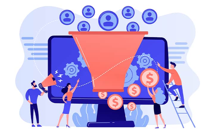
Your landing page visitors often spread across the conversion funnel.
Some may be actively looking for what you offer. While others may be just checking it out albeit having interest—they are a lot.
Bridge this difference and create an effective landing page by understanding your audience better. It is a non-negotiable prerequisite for what is to follow.
1. KISS for Clarity
Tell the customer what you can do for them—be as clear and direct as possible.
Often there is unnecessary clutter on a landing page, and the visitor finds it hard to figure out what you can do for them.
If you can remove something from your landing page and it makes no difference, remove it. Cut out the fancy words and self-serving adjectives.
Instead, present everything centered around your prospect’s needs.
It is key to keep their attention and interest throughout the page.
It saves the visitors from all the guesswork. Otherwise, visitors are easily distracted and bounce off when left on their own.
Make clarity a priority for your entire landing page—not just for the headline or above-the-fold content.
2. Prime with Context
Context goes hand-in-hand with clarity.
Don’t assume your prospect knows what you offer and how you stand out from others.
Context gives your audience a direction and understand your business better.
Tell your audience how your business is going to work for them.
You do not have to explain everything in detail; it can be as short as a couple of sentences. But it needs to be precise and clear.
It is even better if you can show them with an impactful image.
Ensure your landing page answers that one make-or-break question to make that conversion.
3. Don’t Build Your Landing Page
Often, landing pages are planned, designed, and created as elements.
Then they are put together as blocks of copy and creativity to build the ‘perfect’ landing page.
The result is a landing page with too many jumps, breaks, and tonal inconsistencies.
If you are looking to create an engaging landing page, think about how your customers will interact with it.
Your landing page is a one-on-one conversation.
Consider it an in-person sales pitch. Like a conversation, it needs to be personal, coherent, and to the point from the headline to your call-to-action.
4. Write A Letter
A letter is a conversation in text.
It is personal and coherent, and you can make it straight to the point.
Hence it makes a lot more sense to start working on your landing page by writing a letter to your customer.
Talk to your customer; tell them what you can offer that makes their life easy. Ask questions and answer the questions they may have.
More importantly, carry the conversation till the end and keep your customer included in every sentence.
And then design your landing page around this letter. Add illustrations and other elements to make it more visually appealing.
This bottom-up approach will keep your landing page easily consumable and customer-focused.
5. Write a Killer Headline
Fact: 5X more people read your headline than your copy.
Your landing page may have the most enticing copy to impress your audience. Yet, it is of no use if your headline falls flat.
Your audience, at best, is likely to skim through your landing page content as quickly as possible and move on. But with the right headline, you take control of the reader’s experience right from the start.
The best headlines are those that grab your reader’s attention immediately. It must also be clear, concise, and connect emotionally.
Successful digital marketers widely use a simple formula to write their headlines.
A Specific Offer + An Impressive Hook
You can also try blending in emotional trigger words that will result in the intended action from your customer.
Use headline analyzer tools to ensure that your landing page headline lures your readers into the content.
Headline Studio by CoSchedule is a tool that amplifies a marketer’s effort in writing a killer headline.
6. Offer Value Above-The-Fold
Above-The-Fold is practically the face of your landing page.
It includes the headline and the content that follows till the end of the screen before scrolling.
You have only a glance for 2 seconds to impress the visitor. It is a quick decision; you don’t get a do-over.
Do it right the first time and earn the scroll to your Call-To-Action.
Make a valuable offer that your customers cannot deny.
Be specific with a complementing visual aid in your above-the-fold—they’re hooked.
Make the empty white space work for you. Declutter and improve the page experience with minimalistic design.
It will channel the focus is where you want it; compels your customers to scroll down.
7. Leverage Social Proof
Making a conversion on your landing page is a constant tug-of-war.
Your customer is evaluating your business versus you enticing them to click the CTA button.
The final hurdle will be the trust factor.
Customers want to feel confident in choosing you. Earn your customer’s trust before they become one.
Display social proof on your landing page—preferably as visual content.
It can be as simple as how many customers you serve. Or an appreciation post from social media.
Your existing customer base is a vital contributor to winning that trust factor. Show your visitors that several other people trust you.
The social proof will reassure your audience.
User-generated content like testimonials encourage visitors to convert and increase your landing page conversion rate.
8. Straightforward Call-To-Action
The decision-making process is already over when your visitor reaches the Call-To-Action.
Call-to-action has one goal: Facilitate the action for your customer to convert.
Make your call-to-action clear, concise, and obvious. In short, less is more.
Things you must follow in your call-to-action:
- Use only 1 CTA Button
- Do not introduce new ideas or offers
- Avoid complex words & phrases
- Use simple words
- Don’t push for action
At times, elements as simple as an exclamation mark in your call-to-action button may seem pushy. Therefore, pay attention to every small detail.
Whether you are a B2B or a B2C marketer, an individual is going to click on the CTA button.
Make it as simple as possible to click; your lead will convert without thinking twice.
9. Optimize Lead Capture Form
CTA button click does not complete the visitor conversion.
The visitor still needs to fill out the lead capture form.
While this is a simple action, you cannot take any chances if you want to increase your conversion rate 3x.
You need to eliminate all the distractions and sustain their attention. At the same time, you also want to keep their interest.
For example, if your lead capture form requires 6-different fields when only 3 are enough, you’re taking a risk.
Similarly, marking all your field as required* may feel like a barrier to your audience.
Steps to optimize your lead capture form:
- Use a lightweight form
- Prefer a simple form design
- Remind leads of your value proposition
- Ask only necessary information relevant to what you offer
- Mark only essential fields as required*
- Be clear and direct about the information you want
- Split test your lead capture form
When it comes to the lead capture form length, digital marketers will have divided opinions.
Should you go for a lengthy form or a short one?
It may depend on your target audience, their stage in the conversion funnel, your value proposition, and other factors.
A smart marketer’s choice would be to implement an A/B test with two different forms.
Figure out what works for your business and your content marketing strategy. Optimize your lead capture form based on the findings.
10. Optimize for Conversion Barriers
Barriers directly affect your conversion rate.
It could be the navigation bar attracting clicks instead of the Call-To-Action button.
Or it could be as simple as an image that ends just above the fold. It might give an impression that the relevant content has ended when it’s supposed to encourage scroll to your Call-To-Action.
The result is a sub-par conversion rate.
Successful marketers use heatmap tools—like Hotjar—on their landing pages.
A heatmap visualizes the user behavior on your landing page—including clicks and scrolls. You can see which areas get the most attention and activity.
With this data, you can breeze through the process of channeling the user’s attention to your Call-To-Action button.
11. Tweak With A/B Tests
Your conversion rate is only as high as how much you adapt and improvise.
That’s where A/B testing comes into play.
A/B testing—or split testing—is a way of testing two variants of the same thing to evaluate their performance and user behavior.
You can A/B test two different landing page designs by conducting identical marketing campaigns in parallel.
However, it is always necessary to be the entire landing page.
You can try A/B testing for your landing page Headline, image vs. video, form lengths, fonts, color variants, Call-to-Action button sizes, anything.
There are many possibilities with A/B testing to fine-tune your landing page for maximum conversion rate.
But remember that if you are testing one element, the other things should be identical. It ensures that the results don’t get skewed by unaccounted factors.
12. Optimize Your Page Load
Your landing page load will influence user experience way before the actual landing.
Internet is a cut-throat environment for business when it comes to page speed. And if your page takes even a second longer, they’re more likely to bounce off your landing page.
And if your page responsiveness is low, it is an unnecessary bad impression on your business.
Guess where it will affect you?
That’s right. Your landing page conversion rate.
Your landing page load speed and responsiveness can be affected by many things.
It could be an uncompressed high-resolution image. It could be gifs or videos or anything.
It is not only the visual content. If your page has too many scripts, it can also affect your page speed and responsiveness.
Steps to improve your landing page load speed and responsiveness:
- Minimize script usage on your landing page
- Compress your images
- Avoid using GIFs
- Use lazy load for visual content
FCP (First Contentful Paint) is a metric you can use to measure your page speed.
Aim for an FCP time below 2 seconds for an optimized landing page.
13. Optimize for Mobile Users
Pages optimized only for the computer screens can change the page experience of a mobile user.
If you aren’t paying attention, your targets could be leaving because of a simple text misalignment.
It is no exception, particularly for B2C marketers.
But with the rise of mobile screen time, B2B marketers cannot take it easy either.
Here are the steps to optimize your landing page for mobile users:
- Make sure your landing page renders as intended on mobile.
- Make the page lightweight and load quickly.
- Ensure smooth scrolling.
- Make the CTA button large enough to click (or tap).
- Make sure the lead capture form is compact within the viewing area.
Final Word:
These 13 tips are practically the best practices for conversion-seeking marketers.
You don’t need thousands of dollars from your marketing budget for a great landing page.
All you need is the right strategy and a little bit of patience. You too can increase your landing page conversion rate by 3fold.
So, what are you waiting for?
Go on and optimize your landing pages. 3x and more conversion rate is well within your reach.